Copyright forbes
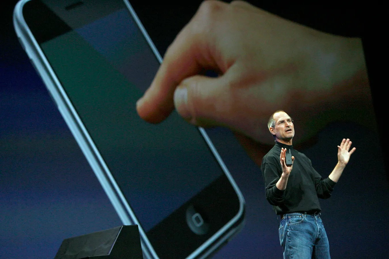
Steve Jobs unveiling the first iPhone in 2007. AFP Photo / Tony AVELAR (Photo by TONY AVELAR / AFP) (Photo by TONY AVELAR/AFP via Getty Images) AFP via Getty Images Try this quick experiment. Do a Google search for ‘Steve Jobs presentation slides.’ Hit images. You’ll find hundreds of photos from Jobs’ now-famous keynotes. Look closely at the slides and you’ll spot a theme: Nearly every slide has a single word, number, or striking image. You’ll likely see the now iconic slide introducing the first iPhone. It shows three images meant to portray an iPod, phone, and internet communicator. The main takeaway is that Apple’s new smartphone would contain all three in one device. Steve Jobs would focus on one number per slide. (Photo by David Paul Morris/Getty Images) Getty Images In most slides, you’ll see one statistic or number that Jobs chose to highlight. On others, you’ll see one prominent word like ‘iPhone’ in large font, followed by just four words: Apple reinvents the phone. Jobs understood what many speakers miss: presentation slides should be as easy to grasp as billboards. Yes, billboards. MORE FOR YOU The Billboard Test for Presentations. Highway billboards are designed to be read in about three to five seconds. If a driver can’t read the words on a billboard or grasp its meaning in three seconds, it’s too much—too much text, too many images, too many messages. Your audience isn’t on the freeway, but their attention is just as fleeting. The billboard test holds the key to designing PowerPoint slides that are impactful and easy to remember. If your slide fails to convey the main point at a glance, it likely has too much information. In most cases, too much text. If you lose your audience’s attention, they’ll quickly move on to something else: emails, texts, apps, or their own thoughts, like I wonder when this presentation will end? While the billboard test has always been important for in-person presentations, it’s even more crucial for virtual presentations. If a person is overwhelmed by a dense, convoluted slide on a large display or monitor, they’ll certainly be turned off by the same slide on the small screen of a smartphone, iPad, or laptop. In my experience as an executive communication coach, I often see professional business presentations with 100 words per slide (yes, I’ve counted). I remind the speaker that those are not slides but memos and documents that double as slides. A document is, well, a document. It’s meant to be read independently with or without you in the room. It can have long sentences, subheadings, and even bullet points. Bullet points are perfectly acceptable in emails and documents because they create space, making the material easier to scan. Bullet points on a slide, however, are often distracting because of a concept neuroscientists call cognitive load. Simple slides reduce cognitive load. Cognitive load is the amount of mental effort your brain uses to process information. It may only weigh three pounds, but the human brain consumes an inordinate amount of energy. When a presenter delivers a slide cluttered with text, graphics, and charts while speaking at the same time, it overwhelms the audience. People can focus on one or the other—you or the slide—but not both. An overwhelmed audience is a frustrated audience. Before you complete a presentation for your next virtual meeting, have a friend or peer take this simple test: Put up a slide for three to five seconds, then take it down. Ask them, “What’s the main idea?” If they can’t tell you, it’s likely you tried to squeeze too much information on one slide. The hybrid strategy for virtual presentations. If your audience requires more information about a topic than you can deliver live (in person or virtual), then use a hybrid strategy. Keep the slides in your presentation minimal and uncluttered, and prepare a ‘leave-behind’ document you can send as soon as the presentation is over. In some cases, like board presentations or investor meetings, your audience might prefer a ‘pre-read.’ That’s fine. If they expect it, send it. For the presentation you deliver, live, however, use the billboard test. Your audience will appreciate its simplicity and reward you with their attention. Remember, if you can’t read a slide on a highway, it won’t work over Zoom. Editorial StandardsReprints & Permissions