I used to rely on a paper planner for as long as I can remember. The system created a loop between intention and action. It also had psychological and therapeutic benefits.
Physically crossing an item off a to-do list brings a scientifically recognized sense of satisfaction, and writing my thoughts decluttered my head and allowed creative mind mapping.
However, the decline of my productivity system began slowly. Problems started as minor annoyances, which I initially dismissed as acceptable trade-offs.
Eventually, these annoyances revealed the paper system’s inherent limitations in a digital world. That’s when I found myself experimenting with a setup that finally convinced me to let go of my dear notebook.
My planner became a one-way archive without a search function
The first major issue was information retrieval. My journals contained meeting notes, project ideas, contact details, book recommendations, and thoughts for later review.
The system excelled at capturing data but was inefficient for retrieving it. I once spent an afternoon searching six months of daily logs to find a recommended contractor’s name.
Manually scanning hundreds of pages was highly inefficient. The planner effectively became a write-once, read-never archive for older information.
This lack of a Ctrl+F for my life became more painful as the volume of my recorded information grew.
A single notebook meant living with the constant fear of losing everything
The second problem was the risk of loss. My planner contained a year’s worth of professional and personal information, including goals, deadlines, and cherished memories.
It existed in only one physical form. This created a constant risk of data loss. It peaked one rainy afternoon when I left my journal on a table at a bustling coffee shop.
The ten-minute panic attack that ensued until I rushed back to find it was a wake-up call. A single event, like a spilled drink or a misplaced bag, could permanently destroy the entire record.
In contrast, digital systems with cloud-based backups offer better data security.
The weight of an A5 journal in a mobile world
The physical reality of the planner also began to wear on me. An A5 hardcover notebook, while beautiful on a desk, is a heavy companion. It added unnecessary weight and bulk to my bag.
On days when I wanted to travel lightly, I was forced to choose between leaving my central organizational tool behind or carrying a bag I didn’t want.
This stood in contrast to my travel-friendly Pixel 9a, a device that was already with me everywhere, effortlessly. The planner became an anchor in a world that demanded mobility.
Shifting priorities made my paper journal messy
My analog system was not adaptable to change. Modern life is fluid. Meetings are rescheduled, priorities shift, and projects evolve.
A paper planner is fundamentally rigid. Whenever I didn’t finish a task, I was forced to physically reschedule it by rewriting it.
Changing an appointment required scribbles and arrows, which created a disorganized page.
These issues revealed that paper planners are optimized for capturing a static moment.
They excel at documenting the present and planning the immediate future. However, they are ineffective for managing information over a dynamic timeline.
Their core weaknesses compound over time, and I knew I needed a change.
What testing Todoist and Notion taught me
I began searching for a digital replacement for my planner and started testing different applications. First, I tested dedicated task managers, such as Todoist.
They initially seemed effective. Features like recurring tasks, reminders, and sub-tasks offered valuable structure and automation.
However, my planner served multiple purposes apart from task management. It was also a journal, a notebook, and a place for reflection.
Todoist is fundamentally task-oriented. Character and project limits, combined with the overall structure, created a restrictive environment.
Next, I tried all-in-one solutions. I initially believed Notion was the solution. The tool could work as a task manager, a wiki, a database, and a journal.
It promised to be a single location for all my information. I began watching tutorials and building complex dashboards with relational databases.
Ultimately, I spent more time building the system than using it. This taught me a valuable lesson. The perfect digital planner had to walk a fine line.
It needed the flexibility of paper, the power of digital search and backup, and the simplicity that would keep me from getting lost in the tool itself.
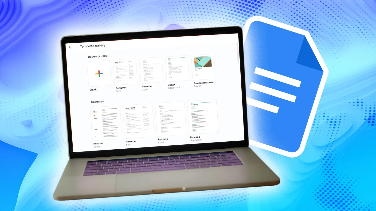
Google Docs struck the right balance
After testing specialized productivity apps without success, I considered Google Docs, a common tool I had previously overlooked.
Initially, I questioned whether a word processor could be a practical planner. Upon reflection, the concept was logical.
Google Docs offered me the same freedom as my old notebook. I could mix tasks, long-form notes, pasted links, and even images on the same page, in any order I wanted.
There was no new app to download, no subscription to pay for, and no new interface to learn. I already had Google Docs installed on my phone, tablet, and computer.
It was a tool already deeply integrated into my digital life, which meant the barrier to adoption was zero.
Google Docs also had features that solved my previous problems with paper-based systems.
First, the search function. Second, its integration with Google Drive provides automatic cloud backups, which removes the single point of failure.
How I structure a year in Google Docs
The foundation of the system is a single, running document for the entire year. Every plan, task, and note for the entire year is in this single document.
This might sound like it would become unwieldy, but the structure we’re about to implement makes navigation effortless.
The key is to impose a hierarchical structure using Google Docs’ built-in heading styles. My structure is as follows:
Heading 1 (H1) for the Year: At the top of the document, I type the current year in Heading 1 style.
Heading 2 (H2) for Months: For each month, I type its name and apply the Heading 2 style.
Heading 3 (H3) for Weeks: Under each month, I add headings for each week, applying the Heading 3 style to each.
After you’ve applied heading styles, go to the View menu and ensure outline sidebar is active. A new pane will appear on the left side of your screen.
The outline scans your document for any text formatted as a heading and creates a clickable, collapsible table of contents.
With the H1/H2/H3 structure, you now have a perfect navigation tree. With the macrostructure in place, the daily entry is intentionally kept simple.
Under each weekly heading (H3), I just start typing. My daily template looks like this:
Why the simplest system is often the best
The Google Docs system I’ve detailed is the answer I was searching for. It successfully marries the best of both worlds.
It gives me the creative freedom and unstructured flexibility of a blank page, allowing me to mix tasks, notes, and long-form journaling.
At the same time, it has the undeniable advantages of a digital tool. Integration with NotebookLM and other Google tools is another bonus.
This transition taught me the goal isn’t to find the perfect app, the one with the most features or the most beautiful interface.
The relentless pursuit of the ideal tool is often just a form of procrastination. The real goal is to build a system that sticks, and the best systems are often the simplest.