Copyright Vulture
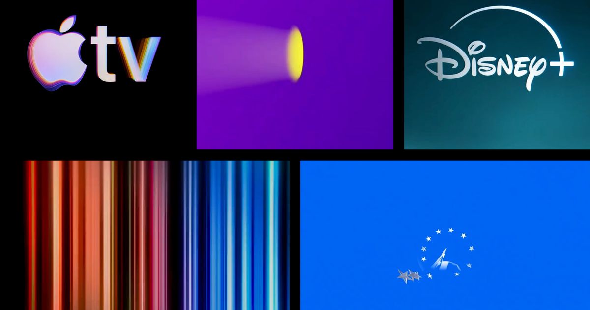
The streaming services have duked it out on several fronts over the years — battling to put out countless movies and TV shows, grow subscribers domestically and internationally, gain live sports and television, and deliver ad-supported tiers to customers. But these streamers are just as defined by how often they reinvent themselves, as with the rebranding of HBO Max a.k.a. Max a.k.a. HBO Max and Apple TV’s recent choice to drop the plus. This week, Apple launched a new bit of logo animation with a mnemonic composed by Finneas. “Hope this very short piece of music feels like it matches the things I love about Apple so much,” he wrote on his Instagram. It made us wonder, What the hell was Apple TV+’s signature sound in the first place? How many of these streamers’ idents (the technical TV term for these things) do we even recall? Like? Hate? We just had to discuss the range of major streamers and their opening bumpers, from the ill-conceived to the indelible. 10. Prime Video Nick: Prime landing at the bottom of the list is a no-brainer. Besides the fact that Prime Video barely registers as a streaming brand in my head next to Netflix or HBO Max, the actual sound it makes is just so very forgettable: generically cheerful in the way an elevator door chime is and nowhere near triggering that primal brain-tingle the good ones do. Plus it doesn’t quite click with the image of Amazon in my head. For a sonic button that really syncs, it should have a thunderous, imperial sound — like big drums — to correspond with Amazon being a giant capitalist Death Star. Savannah: You’re right. Even the Empire had a flair for design, but Prime absolutely does not. No style, no flavor, just a whole lot of blue and a forgettable jingle. I suppose that’s on brand for Prime, though it does no justice to their pretty good originals. 9. Peacock Savannah: Peacock is actually the streaming home of some incredible bumpers: NBC’s jingle and Law & Order’s famous dun dun. But can you recall Peacock’s? Unfortunately, probably not. The rainbow-colored balls stacking on top of one another are cute, but when it comes to the ident, it’s fine. It’s trying to evoke NBC’s three-note chime with its own three-note intro, but man, that’s just tough competition. Nick: Yeah, it’s truly damned by the power of its forebear. The rainbow-chicken chime is really one of those jingles that’s going to endure even if the world ends in nuclear fallout. I think part of the issue with Peacock specifically is that it plays a little too cartoony. That tracks with NBC’s long history with strong comedy slates, but the trade-off is insufficient gravitas. 8. Paramount+ Nick: I don’t mind the Paramount+ bumper. In fact, I actually appreciate the attempt to “streaming-ify” the classic mountain logo. There’s a way you can view this as a stately and self-referential nod to preserving the Hollywood heritage of Paramount (now owned by David Ellison’s Skydance, obviously). But the end result does have the unfortunate effect of feeling a little too … stiff? Stuffy? Whatever the right descriptor is, it’s missing sizzle. Savannah: Yeah, kudos to Paramount+ for attempting to add a little drama to their bumper, opting for a jazzier riff over a simple three-note intro. 7. HBO Max Nick: The weirdest thing about the most recent HBO Max bumper is how sleepy it makes me feel. The multi-beat tapping — like someone testing a mic on loop — sits atop a slow sonic swell and a visual that feels like falling through a tunnel. All of which is to say there’s a hypnotic quality to the bumper, but not in a way that feels particularly good. I suppose it suffers from a similar issue to Peacock’s: The classic HBO ident, static over a surging chorus, is so memorable and has come to occupy a warm space in my heart, so much so that anything else will pale in comparison. And beyond that, the streaming ident doesn’t really say anything about HBO Max as a brand — fair enough, since the whole Max-to-HBO Max arc suggests the brand hasn’t exactly known what it wants to be, either. Savannah: Yeah, and considering how much it’s dialed back on Max Originals, you mostly get hit with the nostalgic HBO static over Max’s beep-boop swell anyways. I wonder if the streamer has lost faith in its bumper. HBO Max is the queen of rebranding, but, you know, I actually find the hypnotic quality of what I’m dubbing the beep-boop swell soothing and well done. I’d weirdly miss it if HBO Max ever got rid of it like it did the majestic purple. 6. The Criterion Channel Savannah: Well, well, well. My stance to not include the Criterion Channel on this list was vetoed by our editors. I love this streamer, but for the purposes of this ranking, I desperately wanted a sound to accompany it — but alas, it’s chic to go quiet these days. Am I cheugy for wanting Criterion to at least include a projector whirring? Maybe! But I’m for fun, and that’s fun! Nick: Silence is elegance, Sav. I love it. It stays. 5. Hulu Nick: Despite getting sucked up in the confusing swirl of Disney’s various streaming brands (Hulu, FX on Hulu, all now accessible through Disney+, where you can also get ESPN+), Hulu has done a solid job establishing and retaining a brand identity. I can’t look at that lime color and not think of Hulu, and these days, the streamer’s “Live Sports on Hulu” ad campaign still barges into my head as an occasional intrusive thought. The bumper nails that general energy, opening up with crowd sounds before the big Hulu logo emerges to leap out and assault you. I’m into it. Savannah: The Hulu lime is its Brat green. As for the sound, I admire Hulu for trying to nod at the feeling of watching something with a crowd. No other streamer has something like it. It mimics the hush before a movie plays. You may be sitting all alone in your living room, but you know it’s time to lock in to All’s Fair when that sound plays. 4. Disney+ (with the click) Savannah: I think out of all the new streamers, Disney+ actually has a sound that I most easily remember. I think the color scheme, which it’s said is a way to cohesively blend Hulu and Disney colors together, is kind of awful. But what’s inspired is the simplicity of the snap-click when the arch hits the plus. It’s Pavlovian. I imagine when kids hear a snap in the wild they turn their heads to see where Bluey is playing. Disney+ would be higher if it didn’t attempt to drown most of the snap-click with a loud orchestral warm-up playing over it. Maybe that’s more of a sound-mixing problem. Nick: The click, really, is the entire game here. It’s so crunchy. Tactility is super-underrated in digital design. 3. Netflix Nick: TUDUMMMM. It’s a testament to Netflix’s pure dominance in the streaming world that tudum is both a legible word and a sequence of letters that immediately provokes the sound and the image of a Giant Red N in your head. It’s become one of those slippery branding feats, like “Twitter,” where it’s hard to tell if it’s sticky because the company’s been so successful or because it’s genuinely sticky. In any case, ubiquity has its limits, beyond which it starts to work against itself: These days, tudum just signals background noise. My iPhone alarm has the same effect. Savannah: TUDUMMMM. The start of it all, really. Netflix has milked so much out of that now-instantly recognizable sound. Everything is tudum. So I feel that unfortunately, yeah, that’s diluted some of its power, but also it’s Netflix. As we’ve learned in the past few years, it’s too big to fail — even in this ranking. 2. Apple TV Nick: I hate to say it, but this stuff is really what Apple does inordinately well. The old intro bumper was smooth and serviceable enough, but this new iteration is just so pleasant — a little spa sesh for your brain. Savannah: Apple knowing how to brand? Color me shocked. And it was filmed with practical effects, no less. I thought I would need some time to stew on this new Finneas-composed intro, but man, it’s hard to resist how shiny and pretty it looks and sounds. The way the chord just flitters and reverbs alongside the flipping of the Apple colors … sigh. 1. Tubi Savannah: To loosely quote Michelle Obama: Tubi, you have done it again. Constantly raising the bar for all of us. Once you’ve listened to this bumper, you can’t ever get it out of your head: “Tuuuubiiiii, Tubi!” It’s short, clever, creative, and such a fun earworm. It also helps that the bumper animation adds such a playfulness to the jingle. Tubi is for the people! Nick: Yep. It’s perfect.