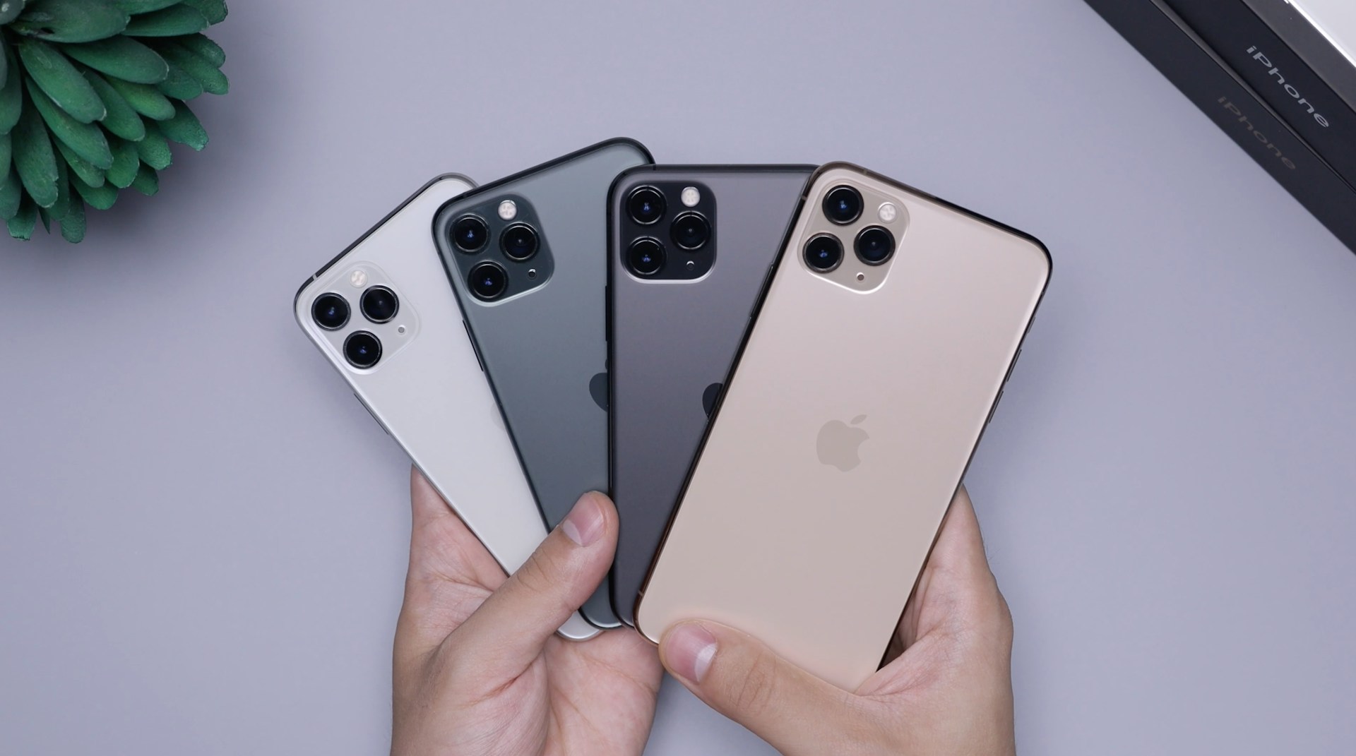
Apple’s highly anticipated iOS 26 update has frustrated users, whose grievances span from serious battery drain to contentious new design elements.
Rolled out just ahead of the iPhone 17 release, the update was intended to highlight Apple’s next major step in user experience. Instead, it has spurred criticism on social media sites, with many dubbing it one of the company’s most divisive updates in years.
Battery Drain Frustrates iPhone Users
Only a few hours after the installation of iOS 26, Tech Times reported a surge of complaints about the iPhone’s battery health decline. Users on X and Reddit reported devices overheating. In just a few hours, users noticed that their devices’ battery health had depleted.
One user reported their phone dropping from 100% to 79% within less than an hour, while another stated, “iOS 26 is making my phone a brick.”
Apple countered by assuring users that transient performance slowdowns are usual post-major updates. The updated support documentation states that devices execute background tasks like data indexing and app updates, which may temporarily affect performance as well as thermal stability.
The Cupertino giant also noted that there are certain new features that demand extra system resources, which might cause the problem.
The ‘Evil Red Clock’ Controversy
Aside from battery issues, users are ridiculing what they refer to as the “evil red clock.” With iOS 26, rotating the iPhone on its side brings up a new lock screen clock.
In dim conditions, it displays as a glowing red clock face on a black surface, something many explain as spooky and unsettling, according to The New York Post.
On TikTok, a user vented that whenever she goes to bed at night, she sees the “most terrifying clock of all time.” Some claimed the feature woke them up during the night, while others claimed the color choice was unnecessary and aggressive.
Liquid Glass Design Draws Mixed Reactions
Another significant shift is the incorporation of Apple’s “Liquid Glass” design, the biggest interface redesign that the iPhone maker has done in over a decade.
The update makes icons, menus, and notifications transparent, leaving them with a frosted-glass look. Though Apple marketed the aesthetic as stylish and contemporary, critics reported that the hazy transparency tired their eyes.
One Redditor said that the new background effects made them feel dizzy, and others called notifications “literal eyesores.” Others even likened the backlash to the unpopularity of iOS 7, which was roundly panned for putting too much emphasis on design looks over usability.
Despite the grievances, Apple says these problems are transient and a natural process of adjustment with significant updates. The company also asserts that once background tasks are through, battery life and performance will normalize.
Nevertheless, with widespread condemnation of both functionality and aesthetics, iOS 26 can potentially be one of the most polarizing updates in Apple history.