Copyright PhoneArena
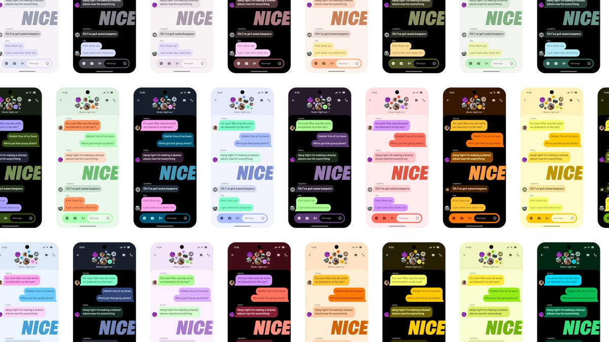
I have a confession: I hate Android’s colors. Not just Material Design 3 and Material You, which I will get to, but also the entire stock Google palette. No matter how you customize your phone, those blinding splashes of red, blue, yellow and green will find a way to pop up and poke at your eyes. Material You’d better not put this on my phone If you are unsure what Material You actually does, don’t worry — I have to google it every time there’s a “Material You update” announcement, too. Basically, Material You is a fancy name for syncing your overall UI colors to the ones of your chosen wallpaper. And it never works out for me. Most of the time, you get a mix of bland, creamy, off-white and off-color interface elements. They don’t dare go too bold, yet they are rarely subtle as well. With no gradient or depth to the colors, the phone’s interface begins to look like a bag of Skittles that has been left out in the sun for a bit too long. You can never get rid of the Blue, Red, Yellow, and Green So, since I don’t like the candybar appearance, I enjoy using interfaces that have a more toned-down look by default. Even Samsung’s One UI looks more polished and “professional” if you will than a Pixel’s UI. And I absolutely loved the “Monochrome” feature when Nothing launched the “Monochrome every app” mode. What’s special about Nothing’s solution is that it doesn’t need icon packs — it does it on the fly. So, even your super-niche and unpopular app that never gets included in an icon pack will get a monochrome icon. Google has added this as a default Android feature now, but it still doesn’t work as well as Nothing’s — some apps will get monochromed, others will not. But that’s fine, it’s still work in progress as I understand it and I have no doubt that we will get there. However, even if you customize your entire interface to be a super-dull, completely devoid of emotion black-and-white, the inevitable notification will come. And oh, horror — it’s in full color! And not something mature or fancy, but the basic, vibrant, Google colors. It’s an eyesore. Mind you, I am not egging on Google’s branding and legacy — I am well aware they’ve been using those colors since ‘98, and it’s all about the signature and recognizability. I don’t mind seeing the Google colors when I get inside the app — be it Play Store, Meet, or whatever. But it’s not cool that it ruins my blanky homescreen appearance. Recommended For You I was wondering why this doesn’t bother me as much on iPhones as it does on Android phones, and I think I figured it out. For one, when you have a notification waiting for you on iOS, it’s not displayed with its full-colored icon at the top-left of the screen, as it is on Android, so the aesthetic of the homescreen is not changed. Secondly, when I pull down the notifications shade, the icons are much less emphasized — they are often smaller than the text they are attached to, and their color saturation seems to be dialed down a bit. I am aware that Material Design is not just about color To be fair, Material Design is about the full UI experience, not just the color. From title, subtitle, and regular text sizes and typescale, to the size and positioning of interface elements, their shapes and animations, their responsiveness as you interact with them. And some of it is good. Some guidelines do help clueless UI developers put the important controls front and center, make them easily accessible or easily visible. Hooray! But other choices are… questionable. I’m sorry, I’m just not a fan of the squiggly lines and plethora of star-based shapes. It could just be me making this association, but is this what my phone is supposed to look like: And I feel I may be in the wrong here. Material Design has been lauded and welcomed by the community. I don’t understand the hype to a point where I need to talk to my therapist about it. Then again, a lot — a lot — of Android manufacturers do not adhere to it, so maybe I am not the only one who’s nuts. Enlighten me and share your opinion on Material Design, Material You, and the ever-present colored icons below! Travel Easy with Nomad eSIM – 25% Off 25% off eSIM data-only plans & global coverage - enter code IPHONE25, sign up required Check Out The Offer Follow us on Google News