Copyright Santa Rosa Press Democrat
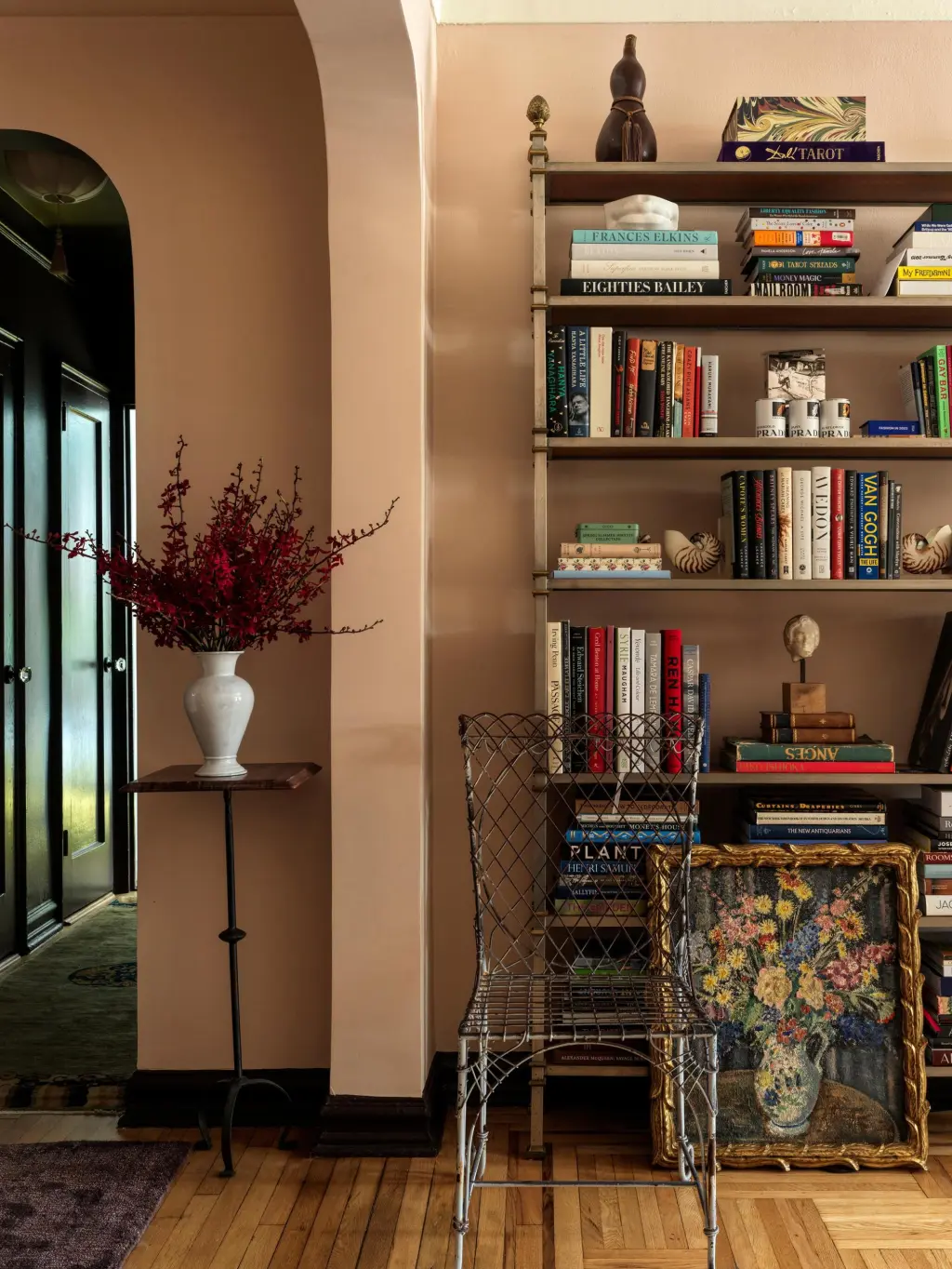
A craze for pastel wall paints is gripping fancy households, but they are not the saccharine tones common of baby nurseries. Here enters the dirty pastel palette, a spectrum that includes dusty rose, mucky light green, grimy ice blue and oxidized lilac tones. The colors, which can look like a pastel that has taken a too-large dose of colloidal silver, are often mixed with dabs of gray, black or ocher and are prized for casting a moody, enveloping effect. Tastemakers from the self-care and fashion worlds are opting to live in pastel-frosted homes. The colors have even made appearances outside domestic life: They were favorite backdrops for exhibitors at the European Fine Art Foundation fair in New York City in May; last month, the Brooklyn apartment of Tony Liu, co-founder of the fashion industry Instagram account Diet Prada, went viral for its decadent design and allover pastel use; and models slinked down Prada’s runway show during Milan Fashion Week against a wall that reflected somber pinks and blues. Their growing popularity could signal a tiptoe toward more colorful living spaces after taupes, grays and whites drove the look of U.S. households for at least a decade. “They feel a lot more adult and elegant,” said Leanne Kilroy, an American interior designer in London who also writes a Substack newsletter about home decorating. She likened the colors to a new neutral, particularly when painted across the majority of rooms and hallways in a single residence. Lauren Geremia, a designer who said she used the tones liberally in recent projects in San Francisco and New York for her firm, Geremia Design, added that this can make a space feel “like a vintage photograph, a little hard to place time-wise.” The colors evoke a sense of refined taste, not only for those who use them but also for how they are sold. In their marketing, popular luxury paint companies have said that certain dirty pastel shades replicate the look of historic palaces and estates, further bolstering the colors’ air of suitability for high-end spaces. Paint labels that are regarded for their selection of dirty pastel colors often exceed $130 per gallon. Among them are Mylands, Little Greene and Farrow & Ball, as well as Alkemis, a Los Angeles “wellness paint” company that uses ground crystal quartz in its base. Replicating the exact color and effect of these high-end paints is “impossible,” said Chris Trapp, a paint department manager at Marine Home Center in Nantucket, Massachusetts. Still, customers try to copy the look in much cheaper formulations. “An 80% match is close enough for a lot of people,” Trapp said. Color has long been absent from most American homes, usually out of a perception of cleanliness and convenience. This school of thought has heralded a proliferation of gray laminate floors, blindingly white walls and gravel-tone couches. In Nantucket, like other areas of the country, homes are gradually moving away from gray and white tones and toward a judicious use of color, Trapp said. There, shady blues are becoming popular for their tie-in with the island’s nautical mood. In the past six months, dirty greens and pinks have become popular in Portland, Oregon, said Kelley Spicer, the owner of Brush & Trowel, a high-end paint and plaster store in the city. “This is the first color use we’ve seen in a decade,” Spicer said of her broader client base. Though perhaps counterintuitive, the mucky pastel colors can create a more welcoming environment than a more minimal palette, designers say. Trying to make things look more Scandinavian by focusing on grays and white can make a home look “too stark and sad,” Kilroy said. Moreover, this Scandinavian influence has been co-opted by big-box stores that produce fixtures in large quantities, making the look feel too mainstream for some with a more vested interest in home design. “When a designer sees all white and gray, it feels very contractor grade,” said Beth Diana Smith, a designer who lives in Kearny, New Jersey. Using colors like dirty pastels often requires more resources, reinforcing their association with the elite. “It takes thought,” said Frances Merrill, founder of Reath Design in Los Angeles. She applied the palette across the entirety of a recent home commission in Portland to combat the city’s foggy, cold environment. “You either need time or someone who has the time. In that way, it’s a luxury,” she said. Recently, Tata Harper, the founder of a namesake skin care label, painted her home in New Canaan, Connecticut, with a wash of muted pastels like minty green and hazy blush. “Not a lot of people know how to mix colors,” Harper said. “It’s a tricky thing, which is why it’s not very mainstream. It’s a matter of taste.”