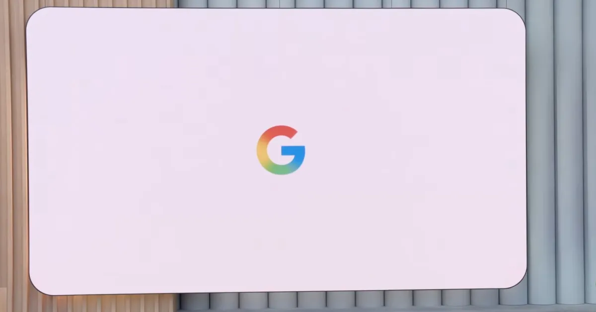
After introducing for Google Search in May, the gradient ‘G’ icon will now be used across the company.
Initially, that G icon where the four colors bleed into each other was just for Search. The Android and iOS apps saw updated homescreen icons, while a new favicon was introduced on the web. That logo is now becoming the company-wide ‘G’ and will replace the old, partitioned icon.
In announcing today, the company is finally talking a bit more about the updated visual branding: “The new ‘Google G’ now represents all of Google — both our brand and the company — and visually reflects our evolution in the AI era.”
Google used “brighter hues and gradient design” to “symbolize the surge of AI-driven innovation and creative energy across our products and technology.” The aim was to stay “true to Google’s iconic four colors,” with the last design refresh taking place 10 years ago.
Advertisement – scroll for more content
Google already brought this design to the “Gemini spark” — as it’s officially called (versus sparkle) — in June, thus phasing out the blue-purple palette.


